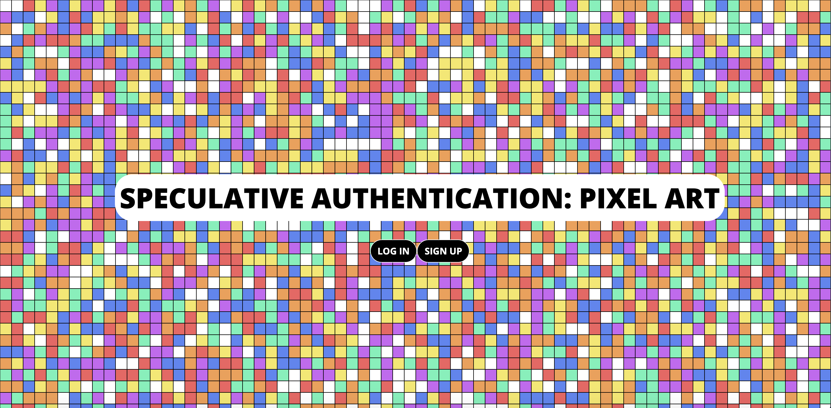
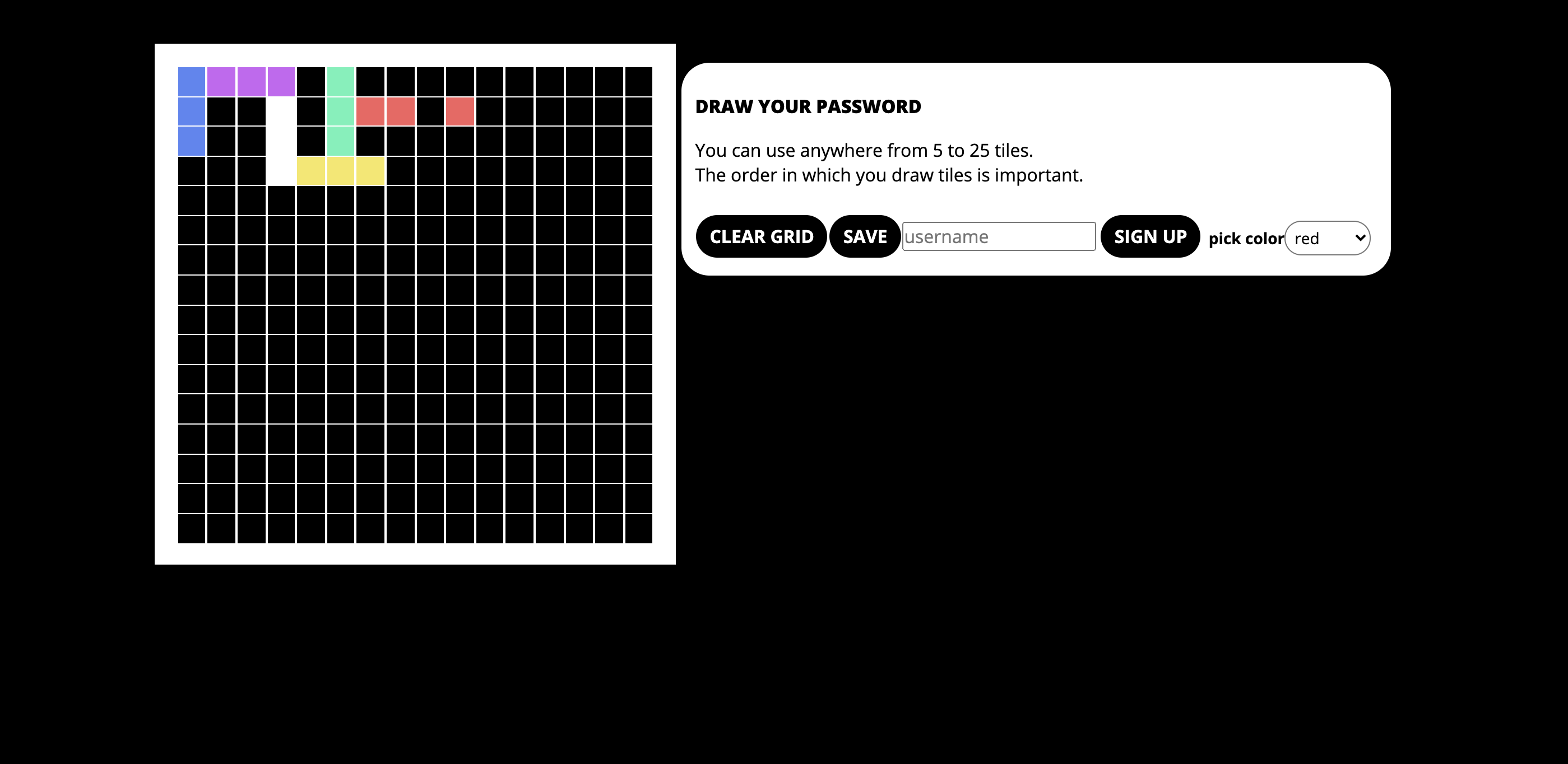
After stumbling across this website documenting the work of a group of artists, designers, and technologists creating speculative authentication methods, I became intrigued. Although they used machine learning in their implementations, I was curious whether I could implement a method that doesn't use machine learning, but still bypasses the traditional word password model.
After playing with color as a password, I changed my approach to using pixel art as a speculative authentication method. Still very much a work in progress (particularly around encryption/hashing/salting/security), but an intriguing exercise in reimagining how we authenticate ourselves online and wondering the possible "what ifs" around it.
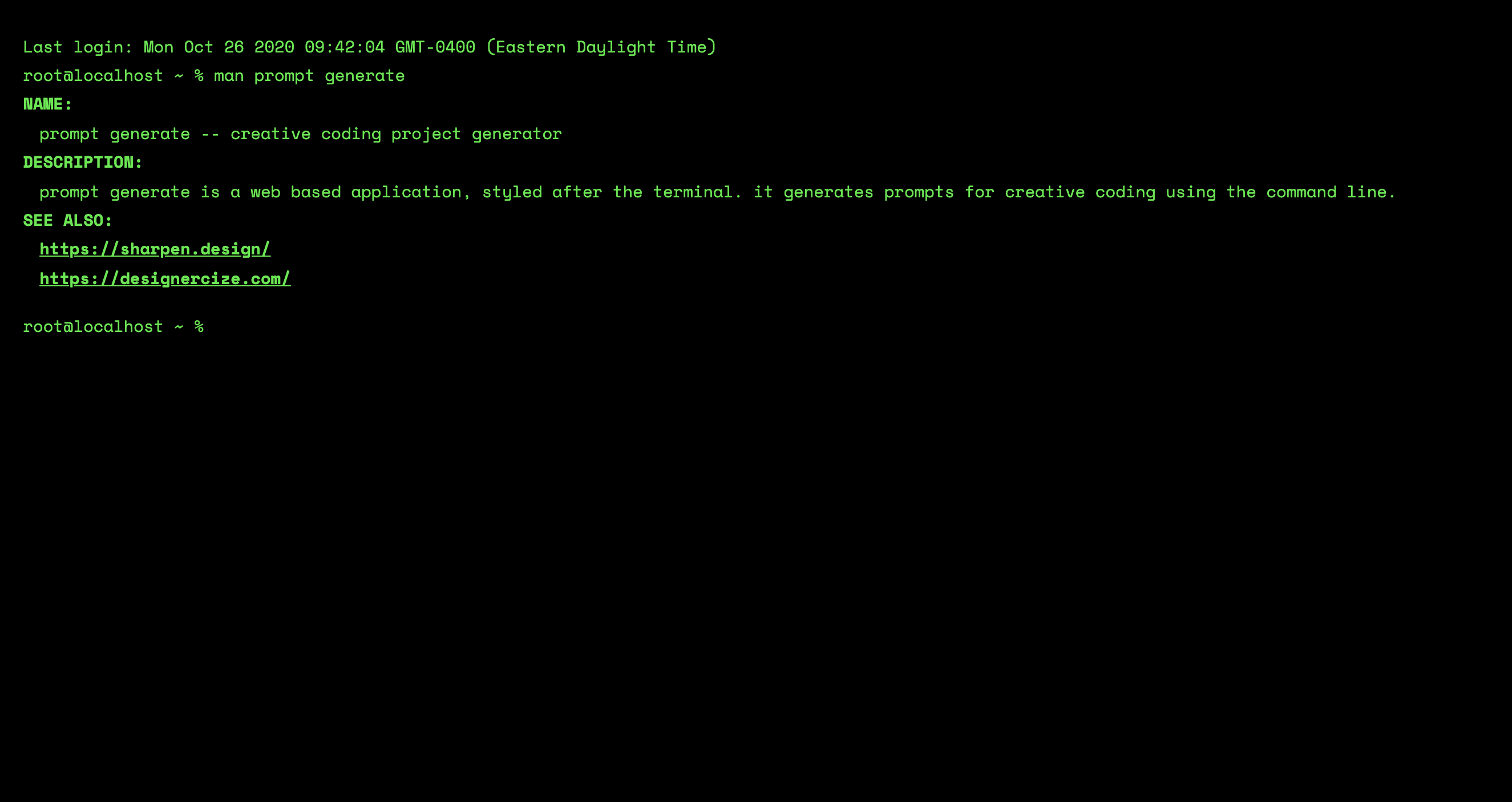
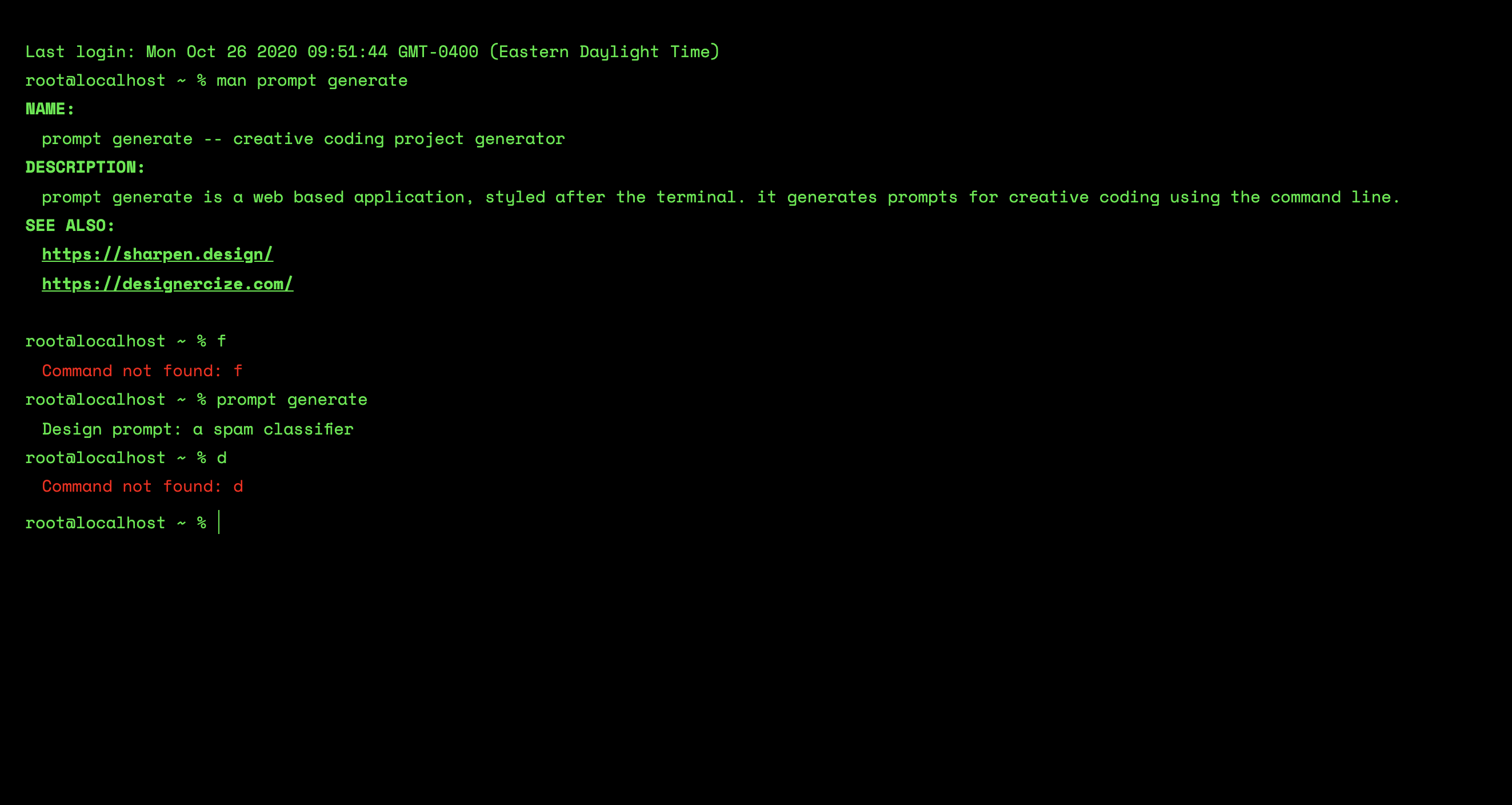
While at Recurse Center, I've been a part of the creative group. One week, we decided to do a mini "Hack and tell" and create something in a 20 minute span. I decided to go with a prompt generator - something to give me prompts for creative coding projects so I don't become stuck with choice paralysis.
I ended up spending a bit more time than 20 minutes on this,styling the prompt generator after the terminal, where users enter commands to either receive prompts, get the manual or "man" page, or clear the console.
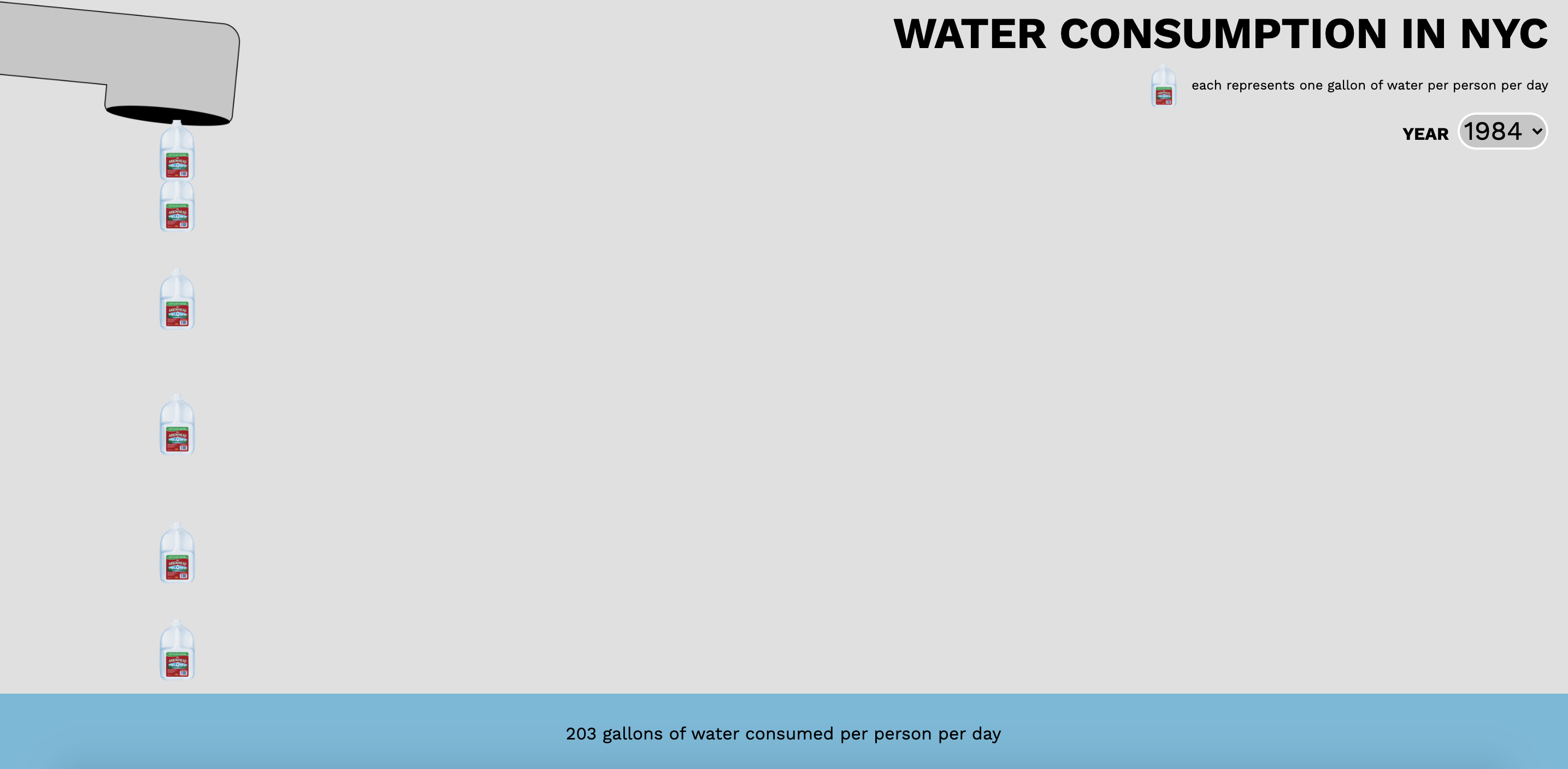
In the workshop, we looked at examples of data visualization that interrogated our assumptions about public data. Most of these examples challenged the traditional, minimalist approach to presenting data (clean lines, few colors, all very neat and meant to convey a sense of certainty and authority- devoid of feeling and pure fact...which in itself is a fiction). We were then set loose on Open Data NYC, public data that's open source and available for anaylizing, visualizing, whatever sort of tricks you have up your sleeve.
I then created a rather simple (if somewhat silly) visualization of the average water consumption in NYC from 1979 to 2019. After selecting the year, a stream of gallon water jugs pours from the spout, with each gallon jug representing a gallon per person consumed per day. The water level rises as each gallon falls to the ground.
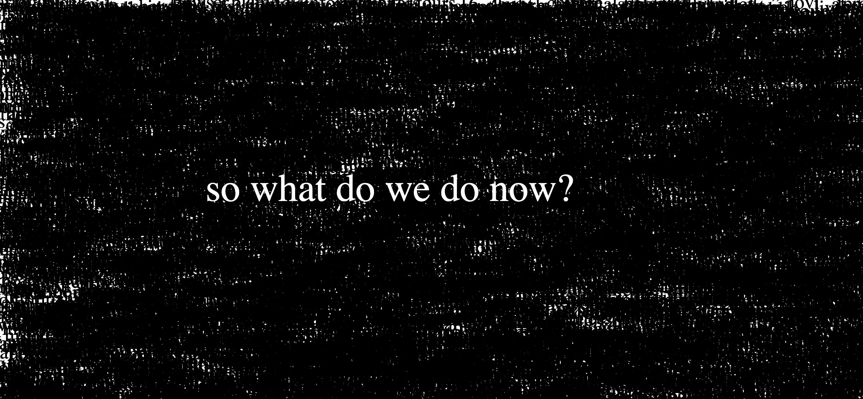
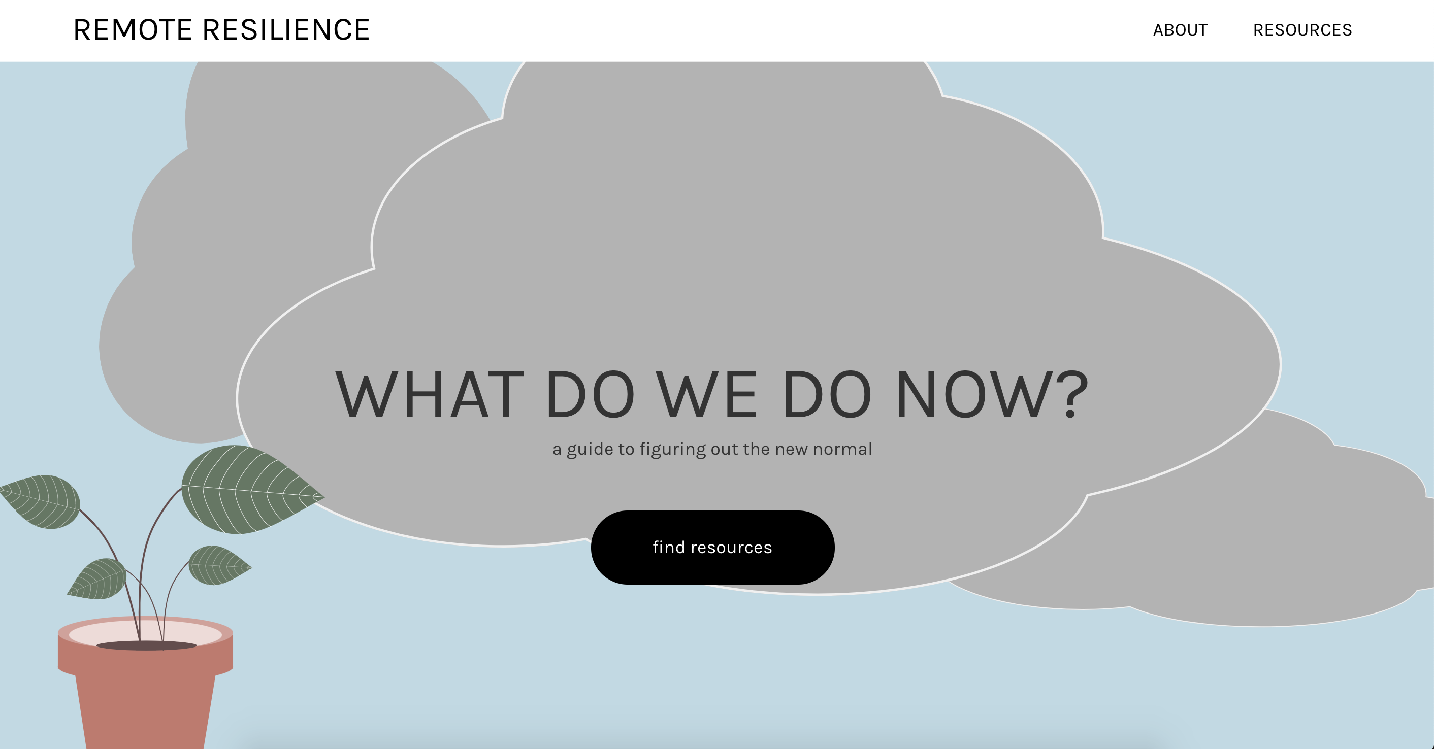
In the week after the Capitol Riot, I've found it hard to disengage with the 24 hours new cycles. I decided to make a net art piece about it. Words scraped from the New York Times coverage appear on screeen, eventually covering it in black. Only then does a question become visible: "what do we do now?" For the full effect, please visit the site.
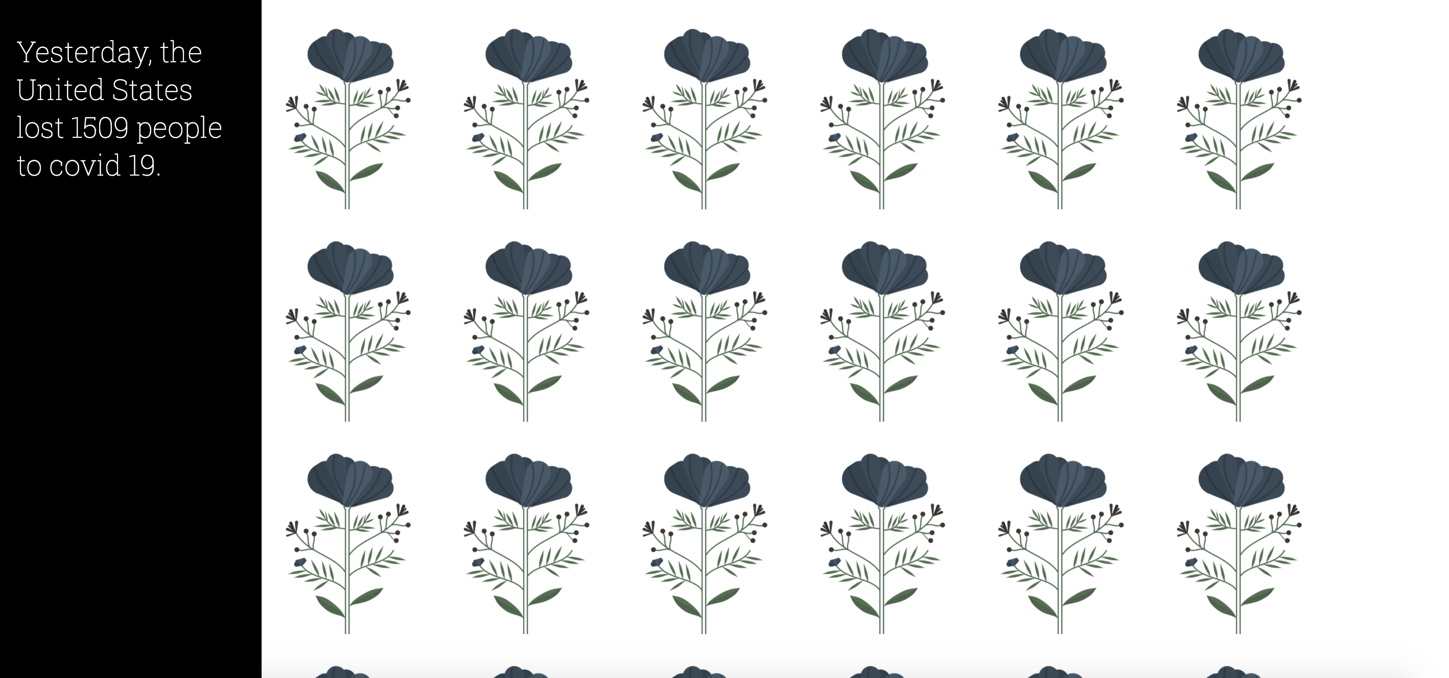
I came across the covid-19 API in late spring 2020. I wanted to create a visualization that had an impact that wasn't divorced from the sad fact that people all across the country were losing their lives, especially as rising apathy began to set in as "pandemic fatigue" set in.
I really struggled with how to go about doing this, a lot of the data visualizations I'd see in mainstream media felt very clinical. The human aspect was lost. Eventually I came to the idea of giving each person a flower. With the number of lives lost now above 300,000 (as of mid-December 2020) and realizing that trying to represent 300,000 + lives each with a flower may crash my browser window, I decided to "give" each person who passed the previous day a flower.
It's somewhat of an empty gesture. I don't know the names of these people, their families, who exactly they were. They become stripped down to a number, a set of data points that I can access through the endpoint of a public API. Though the gesture feels minimal, I hope it at least conveys that each number we see in a news report, each point on a graph, belongs to a person.
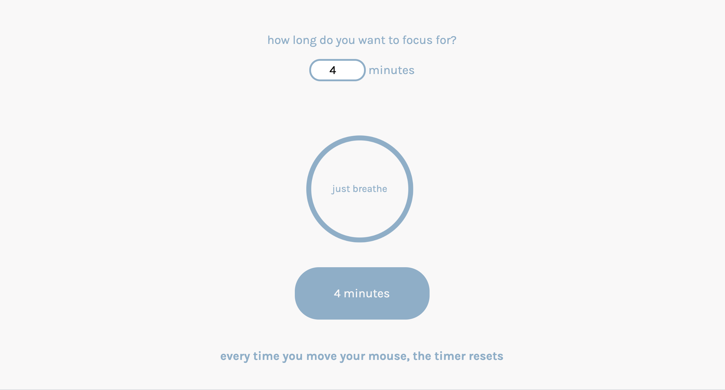
Like a lot of people, I've found myself spending more and more time on my computer since the pandemic has started. I built this to remind myself to take breaks to focus, not on my work, but on my breath.
A user will enter in the amount of time they wish to focus or meditate for and then the timer begins its countdown. If the user moves the mouse, the timer will reset and then begin the countdown again.
Can you make it all the way without resetting? How long can you maintain focus?
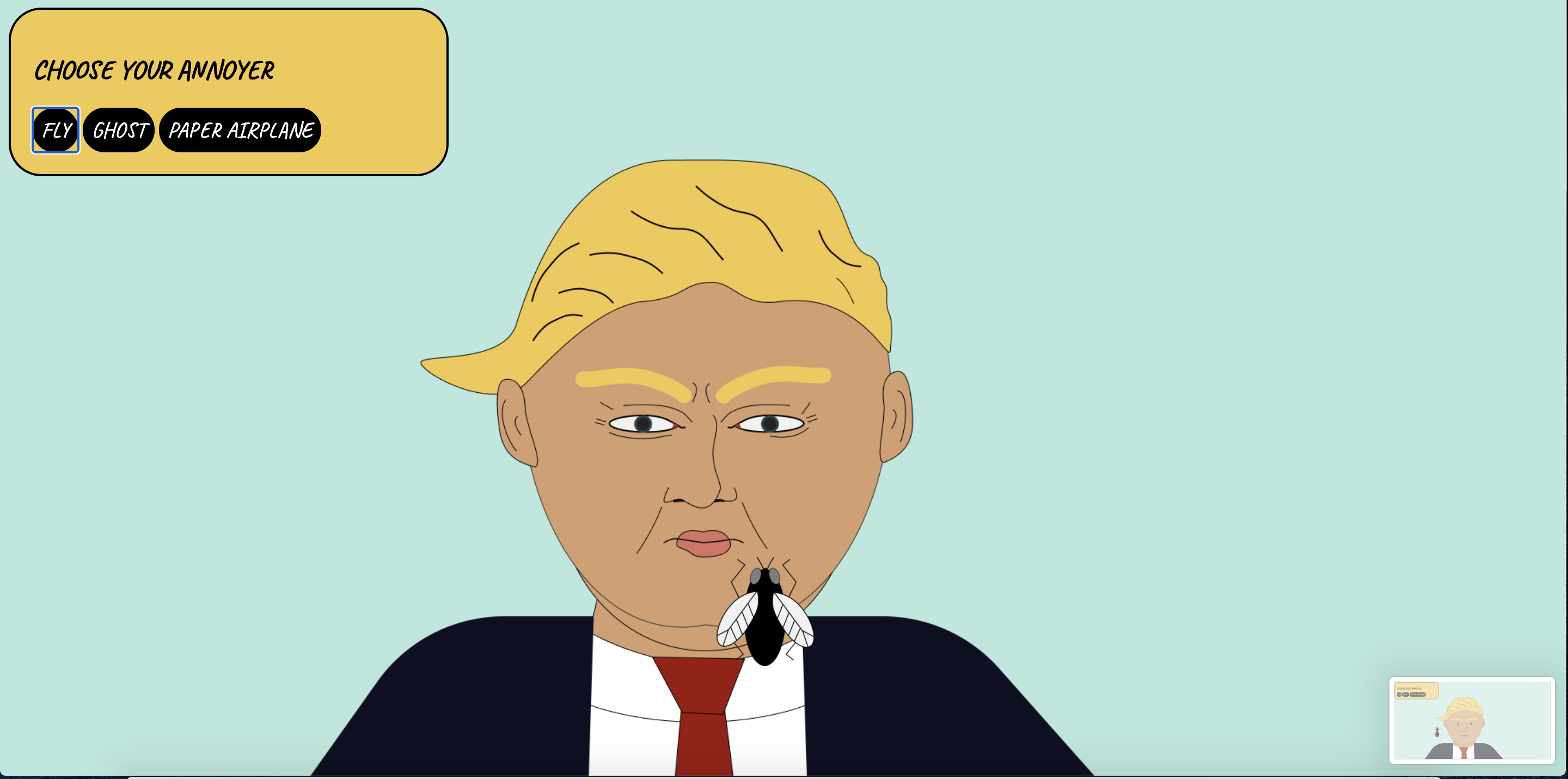
with less than a week before the 2020 election, the ongoing pandemic, continued police brutality, i was up late one night feeling frustrated, annoyed. I decided to make a mostly useless, but definitely carthatic app to annoy the donald. your choice of fly, ghost or paper airplane.
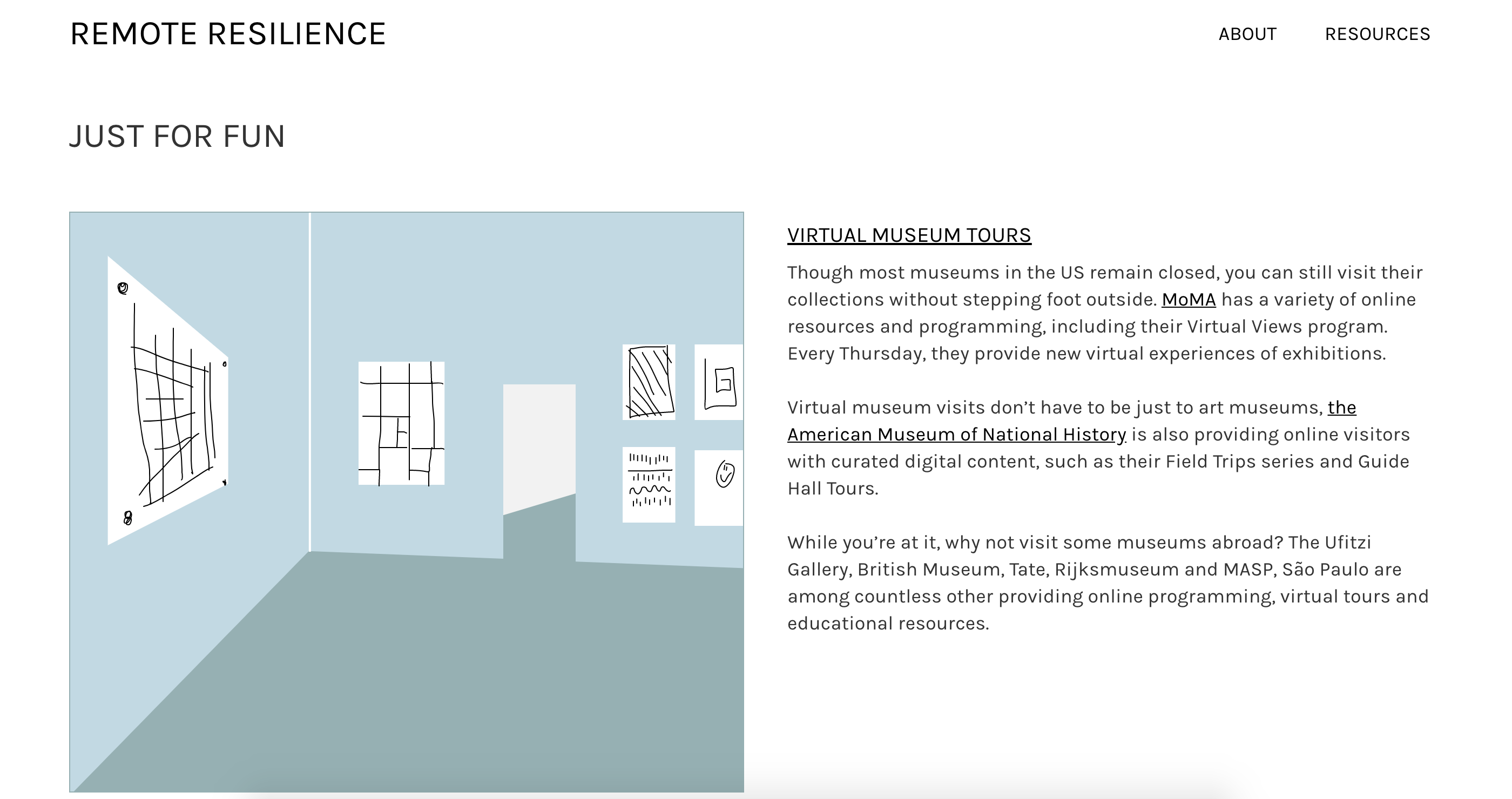
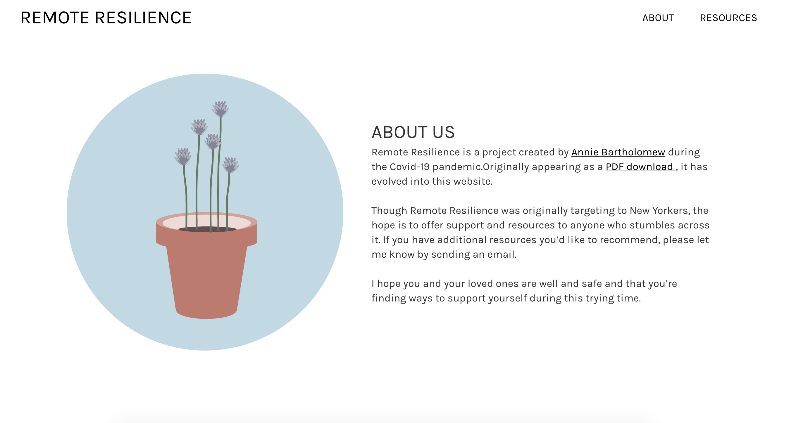
Remote Resilience is an online resource for individuals to find support, resources and fun
distractions during the Covid-19 crisis. Originally taking form as a downloadable
PDF, it morphed into a website for easier access,
broader scope and for improving the overall user experience. I primarily used a palette of
pastels to make the site soothing and approachable and Karla to keep the text clean, legible
and easily read.
In addition to designing the site, I also wrote all the copy, did all the research and coded
it myself. It's still a work in progress, but I'm adding, refining and researching everyday.
=
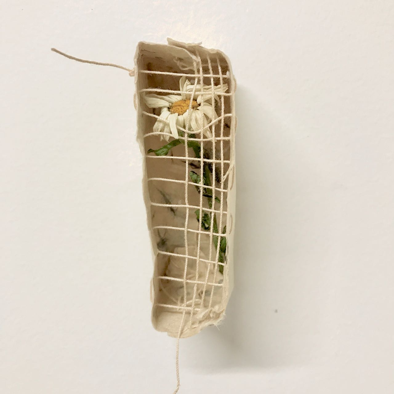
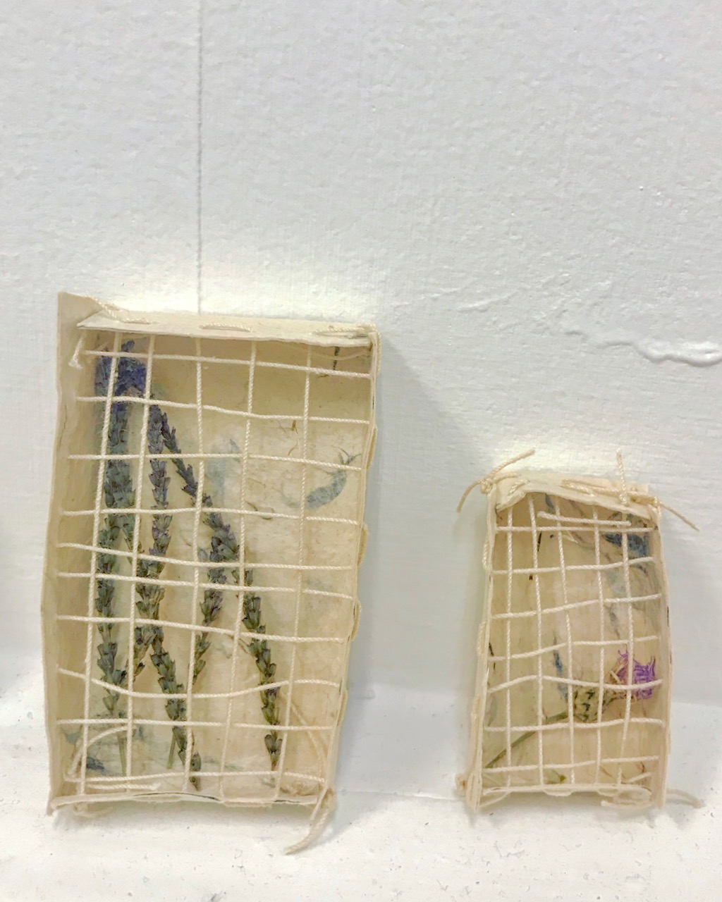
to collect/to protect/to control/to contain
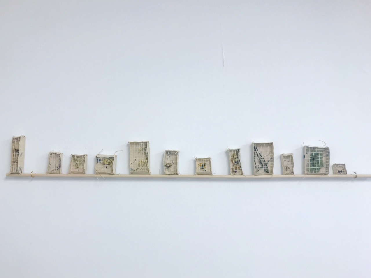
this is an ongoing series that began in 2018 while I was an artist in residence at the
Elizabeth Murrary Artist Residency.
During my time there, I became interested in the ways ephemera informs past experience and
how an experience is remembered shifts with time. I began collecting primarily weeds and
wildflowers around the property and through my collection process, preserving them while
simultaneously letting them degrade. Since then, I've continued on with the series,
collecting plant ephemera from my travels and creating similar enclosures, watching each
change in subtle ways as time marches on.
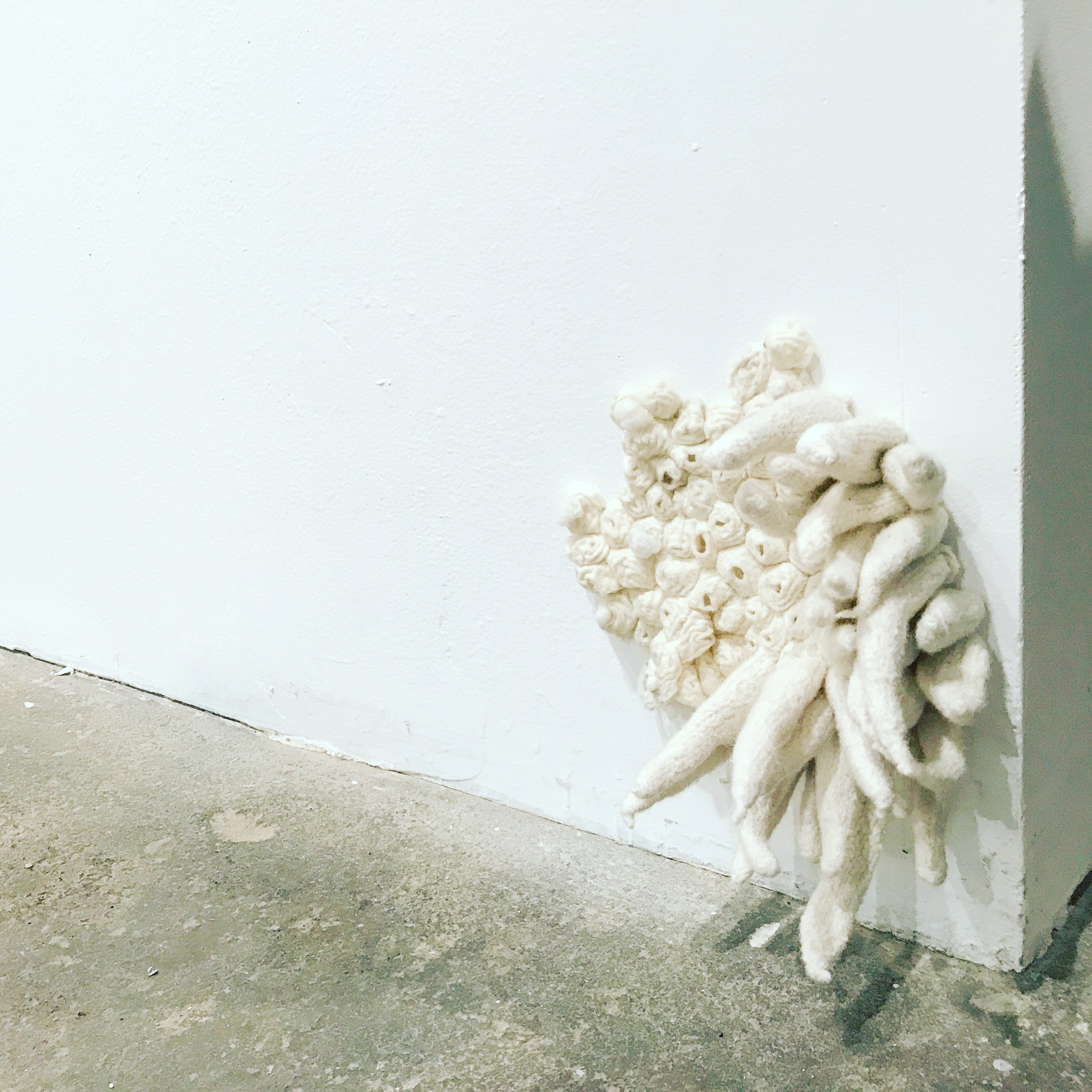
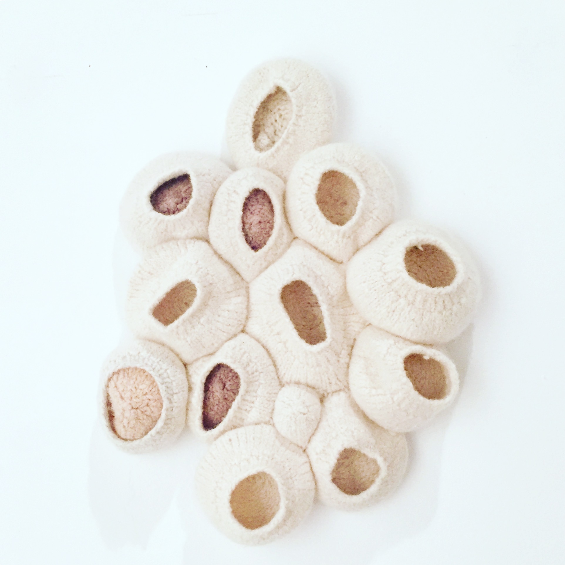
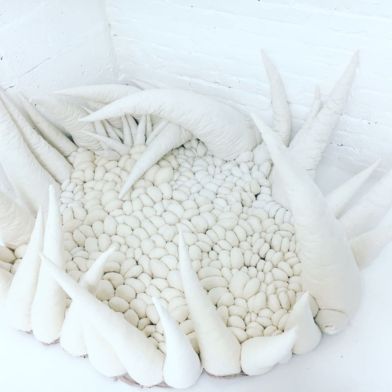
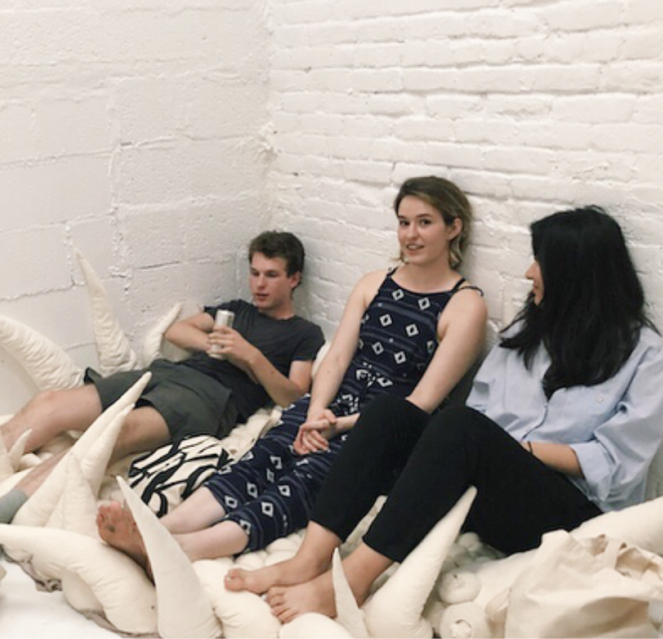
textile work
Much of my recent work uses barnacles as a initial point for examining myself, our relationships and the environment. Who hasn’t realized their own attachments to people, ideas, places, and memories has perhaps grown into something of which they weren’t aware? Who/what hasn’t sought safety, refuge, a place to escape from the rest of the world?
I’m also interested in unpacking all the ways we view nature, objects or organisms considered natural, and reconfiguring our relationship to the places we inhabit. How does this affect our abilities to emphasize with nature? With each other? Interaction, whether it is coming up close or sitting atop a piece, plays a large role in my work.
I primarily use textiles and fibers to create my sculptural work. Working with textiles for me is a form of catharsis, a transference of tension from my mind and body to the threads in the forms I create.
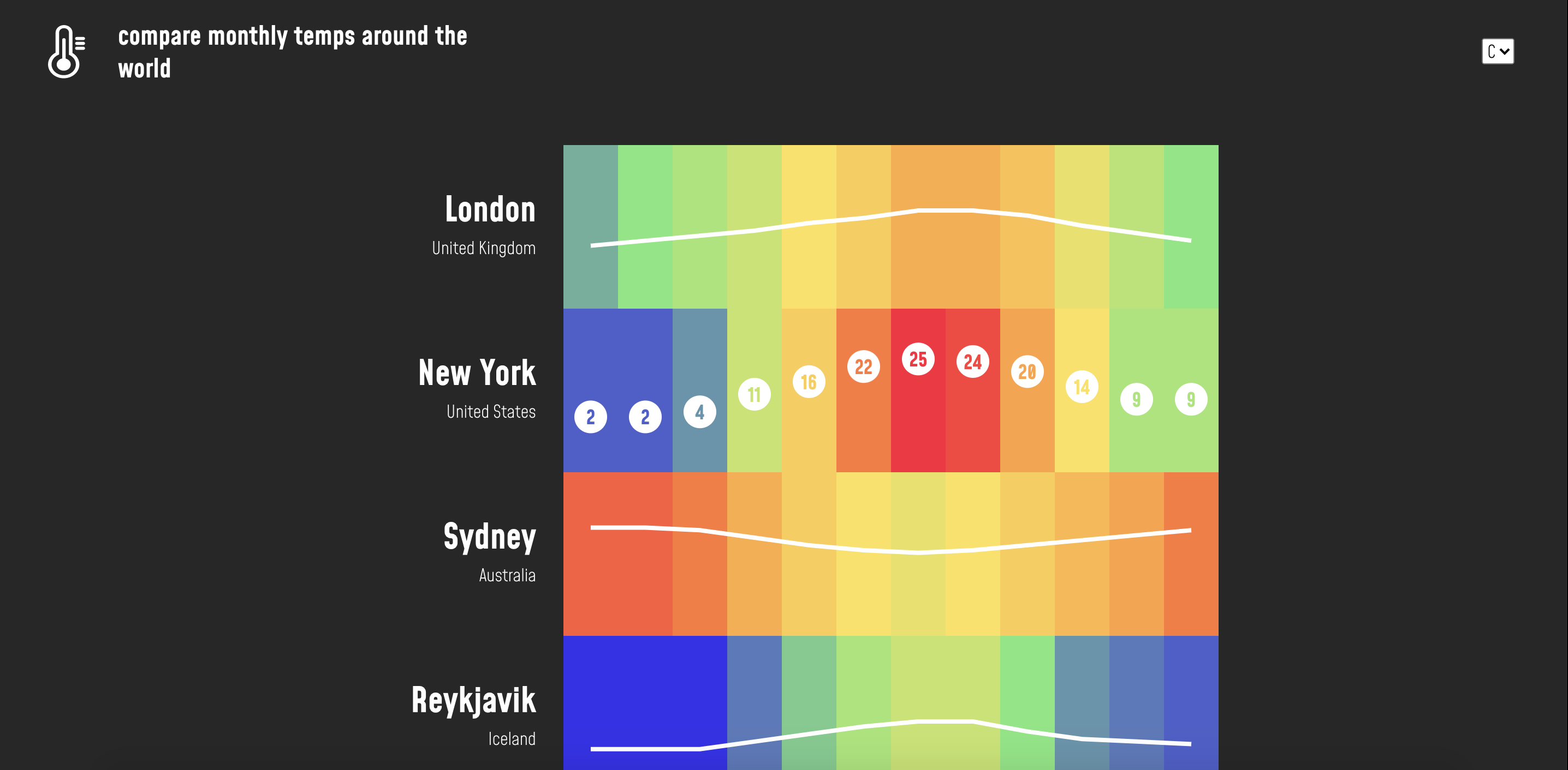
World Heat Map
This project was a learning experience for getting familiar with D3.js, a javaScript data visualization framework. Data was scraped from a site and then cleaned up as a JSON file. Each color coordinates to a temperature range, set using D3 scales. Users can toggle between F + C, which updates the temperatures shown on hover.
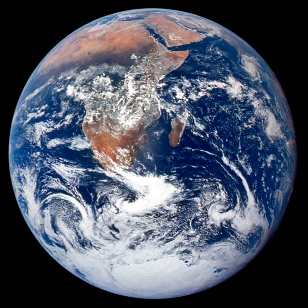
For the project, I was tasked with designing the logo and visual identity for a newly
launched environmental podcast, The Mother Earth Podcast. In less than a week, I had
turned around a complete visual identity, including color pallette, logo, typesetting and
visual elements, for use on their website, social media +marketing purposes. Inspiration for
the logo came from the NASA image
"Blue Marble", which
marked the first Earth day in 1970. The podcast launched close to the 50ths anniversary of
Earth Day and wanted to evoke that image of earth floating in space, while still remaining
approachable and hopeful for the future.
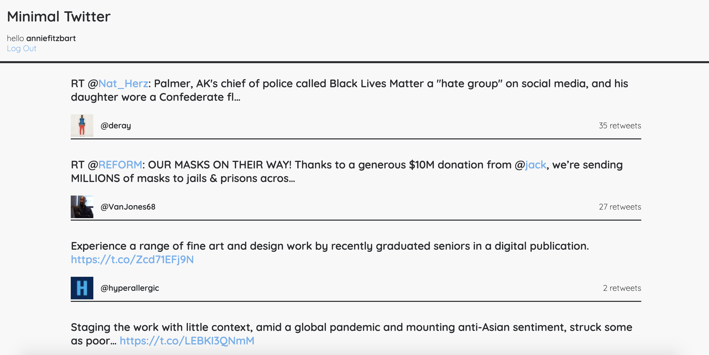
As someone who uses social media, I've long been less than enthusiastic about the visual appeal of my twitter feed. I primarily use twitter as a source for finding articles from activists, organizations and friends. So to create a simplified and easier to digest form of Twitter, I created a web application, aptly dubbed "Minimal Twitter".
I created it primarily using Ruby, Twitter's API and OAuth, designing a simple feed that pulls in a user's feed in a more aesthetically pleasing and less distracting way, allowing the user to more fully concentrate on the content.

 =
=